Turning business data into clearer actions.
Role
Product Designer (Solo)
Timeline
Jun 2025 – Present
Company
BeProEx
Platform
Web
Impact
↓ 20% task completion time

Suiteboard
MAIN NAVIGATION
Overview
Meetings
Team
Vault
Insights
Pipeline
SUPPORT
Feedback
Help & Support

Samantha Walker
samantha@gmail.com
Overview
See what matters. Act where it counts
Pulse
A real time read where pressure is building
Cash flow
$245k
+9% vs last month
Attention
10%
+9% vs last month
Demand
--
Not connecteded
Conversion
12.4%
+21% vs last month
Execution
76%
-16% vs last month
Active Updates
Issues that need review to protect or improve performance.
Liquidity Pressure Escalating
Runway has fallen below your 2-month safety target and continues trending downward
PULSE
11H AGO
Scenario: Increase Ad Spend by 30%
Projected impact across demand, liquidity, and operations looks promising.
TEAM MEETING
19H AGO
Conversion Rate Dropping on Paid Campaigns
Lead-to-booking conversion has declined 9% week-over-week across paid channels.
STRATEGY
19H AGO
Cash Buffer Is Tight
Operating expenses in Sales have exceeded forecasts for the current quarter.
SALES
19H AGO
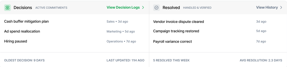
Momentum
Commitments and completed actions shaping performance.
Monitoring
Keeping an eye on things
Cash runway may tighten in 5 weeks
3 invoices are unpaid for over 30 days
Bookings are slightly slower this month
No quote sent in 10 days
Cash runway may tighten in 5 weeks
3 invoices are unpaid for over 30 days
Bookings are slightly slower this month
No quote sent in 10 days
Last month
Product
Suiteboard is an AI-powered B2B operating system that gives small business owners a single view of their finances, sales, and operations, so they can make decisions based on data, not guesswork.
Problem
Small business operators manage multiple roles across finance, sales, and operations at the same time. Information is scattered across different tools and lacks context, making it hard to understand what's actually happening. Decisions end up based on guesswork instead of clear insight.
Goal
Users should be able to open the product, know what's happening, and decide what to do next , without digging through scattered data.
My role and ownership
I owned the experience end to end, user research, information architecture, interaction design, design system, and engineering handoff. I worked closely with the founding team and engineering to define requirements, validate constraints, and ship production-ready designs.
impact
~20% reduction in task completion time across core workflows. Established a consistent design language across the dashboard, financial views, CRM, and AI features.
Design decisions across four product areas
01 — Overview Dashboard
Users needed to know what's wrong first, not see every metric at once.
User insight
What do users need to know first when they open the product?
Most users were tracking their finances across spreadsheets, QuickBooks, and scattered tools. There was no single place to get a quick read on the business. When I talked to them, they described checking their business health as a quick scan. They check cashflow first, then anything overdue, then anything trending down. That order shaped how I structured the page.
Design decision
Surfaced key business signals at the top.
Based on user insights, the page is structured by urgency: current state first, then what needs action, then what's been handled, then what to keep an eye on.

02 — Financial Dashboard
The problem was not the amount of financial data. It was the way it was organized.
What happened
Engineering built a single scrolling page before designs were finalized.
All financial data lived on one page. Users had to scroll through every section sequentially with no way to jump to what they needed.
User feedback
Too much information competing for attention.
During usability testing, one of the problems became clear: there was too much information competing for attention, and users weren't sure where they were supposed to focus.
Design decision
Reorganized into tab-based navigation.
Instead of continuing with one long page, I reorganized the dashboard into a tabular navigation structure. Users could select the section they wanted rather than scrolling through everything sequentially. The goal was to reduce the cognitive load of scanning the entire page and let users choose what they wanted to investigate.
Why this works
Five focused views with a consistent layout pattern.
Each tab represents a distinct financial task: Cashflow & Profit, Outstanding Balances, Recent Payments, Outstanding Invoices, and Vendor Expenses. Every tab follows the same layout, data table on the left, visual summary on the right. Once users learn the pattern on one tab, they don't relearn it on the next.
03 — CRM Pipeline
Users could see opportunities moving through stages, but there wasn't enough context before getting into the pipeline.
Stakeholder feedback
The founder wanted the process to be faster for sales reps.
During a design review, the founder pointed out that the pipeline needed to work faster for sales reps. They were spending too much time scanning through rows to understand the current state before they could take action.
"The sales reps need to know where things stand the moment they open this page, not after scrolling through everything."
BEFORE

AFTER
What changed
Added summary cards above the pipeline.
I introduced summary cards: Attention, Open, Proposals, Follow-ups, and Relations, each with changes versus the previous month. The initial design also showed every pipeline stage fully expanded with no way to collapse them. After the redesign, stages are collapsed by default so the cards give users the overview first. Users can then expand any stage they want to dig into.
04 — AI Huddle
The AI features worked, but the interface got in the way.
Usability finding
Users didn't know how to add an agent insight to the meeting.
The initial instruction said "Add insight to the meeting." Some users expected a button, some tried to drag the insight card. The interaction wasn't clear enough for users to know the insights were actionable.
BEFORE

Users couldn't tell what to do to add an insight.
ITERATION 01

ITERATION 02

Iteration
Making the interaction self-explanatory.
The original instruction said "Add insight to the meeting." Users read it but still didn't know which part of the screen to click. I changed it to "Click insight above to add to meeting" so the action was explicit. But the insight cards still looked static to users. I added an icon to each card, but users weren't sure if it was clickable or just a visual element. "Where do I click?" and "Is this just part of the UI?" came up. So I paired the icon with an explicit action label (Capture), and added a confirmation state (Added with a green checkmark) once clicked. Three clear states: default, capture, added.
Challenge
The founder wanted AI agents always visible, but the layout was creating engineering complexity.
The agents had their own vertical panel on the left side. The founder wanted them visible at all times so users wouldn't forget they were there. But the panel squeezed the chat area, and the minimize option meant engineering had to handle a different layout depending on panel state.
"Every time someone opens or closes that panel, we're handling a different layout. That's a lot of responsive logic for one interaction."
-Lead Engineer
BEFORE
Design decision
Moved agents into a dropdown in the main navigation.
This was the tradeoff. Agents weren't permanently visible anymore, but they were one click away under Teams. The chat got full width, engineering didn't have to build the responsive behavior, and users could still access any agent when they needed one. The founder agreed once he saw that discoverability wasn't lost, just relocated.
Engineering consideration
Removed the need for responsive panel logic.
The vertical panel required engineering to handle four different layout states depending on which panels were open or closed. Each state needed separate responsive behavior. Moving agents into a dropdown reduced this to a single consistent layout. One chat width, no panel states to manage.
AFTER
OUTCOME
Less searching. More direct action.
After implementing the changes, we conducted usability testing where users were asked to perform core tasks: checking business health on the dashboard, finding specific financial information, reviewing pipeline status in the CRM, and interacting with AI agents. We measured task completion time before and after the redesign.
~20%
Reduction in average task completion time.
~4.5 → 3.5 min
Average time per core task, before and after.