Eclipse Curtains

E-commerce website redesign case study

Transformed the website’s online shopping experience by integrating e-commerce, and innovative solution, resulting in improved purchasing processes and stronger customer loyalty and engagement.

Role

UI/UX Designer, UX Researcher

Timeline

14 weeks

Project

Academic Project

What I did

UI Design, UX Design, UX research, Prototyping , Baymard analysis.

UI Design, UX Design, UX research, Prototyping , Baymard analysis.

Tools used

Figma, Miro, Baymard, PhotoShop

Link to E-Commerce Integration

Link to Innovation

BRAND OVERVIEW

About Eclipse Curtains

About Eclipse Curtains

Eclipse Curtains is a window treatment brand specializing in curtains, blinds, and shades designed for light control, privacy, noise reduction, and energy efficiency. The brand offers a wide range of functional and decorative products across different styles, sizes, and room needs.

Eclipse Curtains is a window treatment brand specializing in curtains, blinds, and shades designed for light control, privacy, noise reduction, and energy efficiency. The brand offers a wide range of functional and decorative products across different styles, sizes, and room needs.

Despite having a strong digital presence, the website does not support direct purchasing, with customers redirected to third-party retailers to complete purchases.

Despite having a strong digital presence, the website does not support direct purchasing, with customers redirected to third-party retailers to complete purchases.

Business Problem

What the business was losing

What the business was losing

Relying entirely on third-party marketplaces created major limitations for the brand. Eclipse Curtains had little control over how products were presented, no direct access to customer behavior data, and no ability to retarget high-intent visitors who left without purchasing.

Relying entirely on third-party marketplaces created major limitations for the brand. Eclipse Curtains had little control over how products were presented, no direct access to customer behavior data, and no ability to retarget high-intent visitors who left without purchasing.

The absence of a direct e-commerce experience also meant lost opportunities for customer loyalty, brand differentiation, and higher-margin sales.

The absence of a direct e-commerce experience also meant lost opportunities for customer loyalty, brand differentiation, and higher-margin sales.

Industry data suggests D2C e-commerce can recover 15–30% of margin typically surrendered to retail intermediaries. For a brand like Eclipse Curtains, an owned purchase path isn't just a UX improvement — it's a business model shift.

* Margin figures are industry estimates, not Eclipse Curtains internal data.

A walkthrough of the existing experience before the redesign.

A walkthrough of the existing experience before the redesign.

Baymard Audit

Diagnosing the problem properly

Diagnosing the problem properly

Before jumping into design, I ran a full Baymard usability audit on the existing site. Baymard's methodology evaluates e-commerce experiences across categories like navigation, product discovery, checkout, and trust signals, scoring each against research-backed best practices.

Before jumping into design, I ran a full Baymard usability audit on the existing site. Baymard's methodology evaluates e-commerce experiences across categories like navigation, product discovery, checkout, and trust signals, scoring each against research-backed best practices.

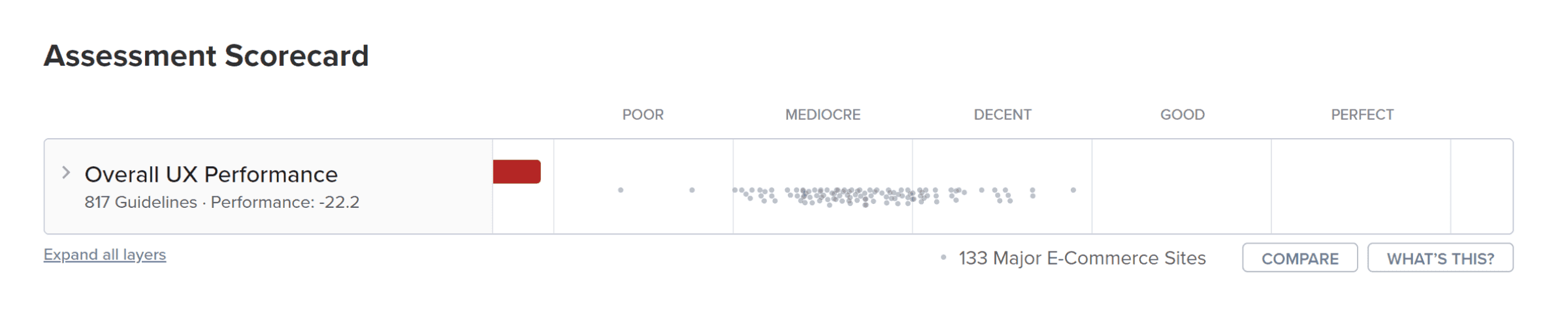
Baymard Score of the existing website

-22.2

The audit surfaced issues across every layer of what a commerce experience needs to function. Here's what the findings looked like in practice:

The audit surfaced issues across every layer of what a commerce experience needs to function. Here's what the findings looked like in practice:

HOMEPAGE AND NAVIGATION

No product categories or discovery entry points

The homepage had a hero video, a brief brand description, and nothing else. No way for a user to understand what products were available or where to go next. Navigation offered no path into a catalog.

Product Discovery

No catalog, no filters, no browsing experience

There were no product listing pages at all. Customers who arrived looking for curtains had no way to see what was available — let alone compare options, filter by room type, or explore by style.

Product Detail Pages

Product pages didn't exist

No specs. No dimensions. No fabric information. No imagery beyond the hero video. For a high-consideration purchase like window treatments, the absence of product-level content makes conversion impossible.

Cart & Checkout

No transactional infrastructure whatsoever

No cart. No checkout. No payment flow. The site had no mechanism for a user to indicate purchase intent, let alone complete one. Every potential buyer was being handed off to a third-party retailer.

Trust & Reassurance

No signals that build purchase confidence

No payment methods displayed. No return policy visible. No customer reviews. For a first-time buyer, there was nothing to signal that purchasing here was safe and backed by the brand.

Process

Building the foundation first

Building the foundation first

Before designing screens, I mapped the pages, features, and flows the e-commerce experience needed. This gave the redesign a clear structure and helped connect every design decision back to the audit findings.

Before designing screens, I mapped the pages, features, and flows the e-commerce experience needed. This gave the redesign a clear structure and helped connect every design decision back to the audit findings.

PAGE INVENTORY - WHAT NEEDED TO EXIST

01

01

Homepage

Homepage

Product categories, "Shop Now" CTA, payment trust signals in footer. The entry point into the whole commerce journey.

Product categories, "Shop Now" CTA, payment trust signals in footer. The entry point into the whole commerce journey.

03

03

Product Detail Page

Product Detail Page

Dedicated product page with imagery, dimensions, fabric details, care information, and a clear add-to-cart action.

Dedicated product page with imagery, dimensions, fabric details, care information, and a clear add-to-cart action.

05

05

Checkout + Payment

Checkout + Payment

Step-by-step checkout flow with clear CTAs, shipping details, payment options, and order review before purchase.

Step-by-step checkout flow with clear CTAs, shipping details, payment options, and order review before purchase.

07

07

Wishlist + Account

Wishlist + Account

Saved items and order history - a return path for the considered buyer who needs more than one visit.

Saved items and order history - a return path for the considered buyer who needs more than one visit.

02

02

Product Catalog

Product Catalog

Filterable grid with facets by room, style, and material. Inline color switching without leaving the page.

Filterable grid with facets by room, style, and material. Inline color switching without leaving the page.

04

04

Cart

Cart

Review screen where users can check selected items, edit quantity, see pricing, and move confidently toward checkout.

Review screen where users can check selected items, edit quantity, see pricing, and move confidently toward checkout.

06

06

Order Confirmation

Order Confirmation

Reassurance that the purchase went through. Order summary, delivery timeline, next steps.

Reassurance that the purchase went through. Order summary, delivery timeline, next steps.

08

08

DIY Design Studio

DIY Design Studio

Custom curtain builder where users can choose type, color, pattern, and upload their own design for a personalized order.

Custom curtain builder where users can choose type, color, pattern, and upload their own design for a personalized order.

Lo-fi wireframes

With the user journey defined, I translated the structure into low-fidelity wireframes to validate layouts, content hierarchy, and interactions before moving into visual design.

Design Outcomes

Simplified Navigation

To enhance the e-commerce experience, the navigation bar now includes Wishlist, my account, and cart options, streamlining user access to essential functionalities.

A prominent "Shop Now" CTA was placed in the hero section to drive immediate engagement.

Additionally, clear product categories have been introduced on the homepage to help users find what they need quickly and the footer now showcases diverse payment methods, ensuring a seamless and secure checkout process for all customers.

Enhanced Product Browsing

Further, a dedicated product catalog page with detailed filters was introduced, making it easier for customers to browse and find products. The product detail page was also added to provide comprehensive information about each item, including images, descriptions, and specifications.

Streamlined checkout process

I further improved the user journey by adding essential pages such as the cart, checkout, payment, order confirmation, wishlist, and my account pages. These additions ensure a seamless and intuitive shopping experience from browsing to final purchase.

Innovation: DIY Curtain Design Studio

This innovation aims to enhance customer acquisition and retention by providing a personalized and engaging shopping experience, ultimately driving increased sales and brand loyalty.

With the DIY Curtain Design Studio, customers can fully customize their curtains by selecting the type, color, and pattern that best suits their style.

Additionally, I introduced an option to upload designs of own choice, allowing users to create truly unique curtains. A dedicated customer support page has been added to assist with any inquiries or issues during the customization process.

Design Challenge

Design Challenge

How might we design a user-friendly e-commerce platform for Eclipse Curtains that streamlines the buying journey, fosters brand engagement, and captures valuable customer data to drive sales and brand loyalty?

Design Outcomes

Simplified Navigation

To enhance the e-commerce experience, the navigation bar now includes Wishlist, my account, and cart options, streamlining user access to essential functionalities.

A prominent "Shop Now" CTA was placed in the hero section to drive immediate engagement.

Additionally, clear product categories have been introduced on the homepage to help users find what they need quickly and the footer now showcases diverse payment methods, ensuring a seamless and secure checkout process for all customers.

Enhanced Product Browsing

Further, a dedicated product catalog page with detailed filters was introduced, making it easier for customers to browse and find products. The product detail page was also added to provide comprehensive information about each item, including images, descriptions, and specifications.

Streamlined checkout process

I further improved the user journey by adding essential pages such as the cart, checkout, payment, order confirmation, wishlist, and my account pages. These additions ensure a seamless and intuitive shopping experience from browsing to final purchase.

Innovation: DIY Curtain Design Studio

This innovation aims to enhance customer acquisition and retention by providing a personalized and engaging shopping experience, ultimately driving increased sales and brand loyalty.

With the DIY Curtain Design Studio, customers can fully customize their curtains by selecting the type, color, and pattern that best suits their style.

Additionally, I introduced an option to upload designs of own choice, allowing users to create truly unique curtains. A dedicated customer support page has been added to assist with any inquiries or issues during the customization process.

EVALUATION

EVALUATION

Running the audit again

Running the audit again

After completing the redesign, I ran the Baymard assessment again — using the same methodology and criteria as the initial audit. This gave me an apples-to-apples comparison of what the design changes actually moved.

After completing the redesign, I ran the Baymard assessment again — using the same methodology and criteria as the initial audit. This gave me an apples-to-apples comparison of what the design changes actually moved.

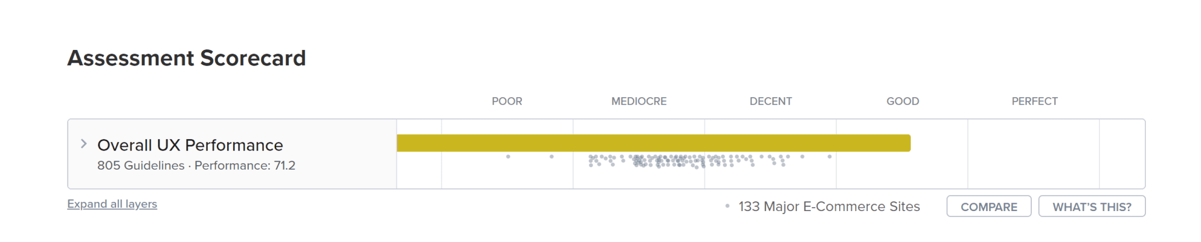
Baymard Score of the redesigned website

72.1

Validation

Testing with real users

Testing with real users

To validate the redesign beyond the Baymard score, I ran usability testing sessions with 8 participants. Each session focused on three tasks: browse and add a product to cart, use the DIY Studio to configure a custom curtain, and complete the checkout flow.

To validate the redesign beyond the Baymard score, I ran usability testing sessions with 8 participants. Each session focused on three tasks: browse and add a product to cart, use the DIY Studio to configure a custom curtain, and complete the checkout flow.

8

Total Participants

97%

Avg. Task Completion Rate

15

Avg. Testing session

What worked?

Users found the navigation intuitive and easy to use.

The overall aesthetic of the website was appreciated for being visually appealing and engaging.

Users liked that they could change the curtain color on the product catalog page and see the transition without going to the product detail page.

The DIY Curtain Design Studio was well-received for its user-friendly interface.

The real-time preview feature was highly appreciated for visualizing the final product.

What didn’t?

In the DIY Curtain Design Studio, the lack of filters for sorting fabrics by best selling, price (high to low), etc., was noted as a drawback.

Users noted that the "Select Color" and "Select Pattern" sections lacked labels and descriptions, leading to confusion and complicating the selection process.

Users noted that the CTA on the payment page was labeled "Save & Continue" rather than "Place Order," creating uncertainty about completing their purchase.

Reflection

What I'd do differently

What I'd do differently

01

Define success metrics before designing

I measured impact at the end. I should have set a checkout completion rate target upfront and let it shape prioritization throughout the project, not just audit the results afterward. 

02

Design with real copy from the start

The CTA issue showed me that placeholder text can hide small but important problems. In testing, “Save & Continue” was not clear enough. Next time, I would use more realistic copy in wireframes so these issues show up earlier.

OUTCOMES

An informational site that now has something to sell

The project started with a brand site that had no direct purchase path and ended with a fully designed e-commerce experience, from product discovery to order confirmation. The Baymard audit gave the redesign a structured foundation, while user testing helped validate the experience under realistic conditions.

−22.2 → 72.1

−22.2 → 72.1

Baymard UX score

Baymard UX score

97%

97%

Task Success Rate

Task Success Rate

15

15

Pages built from zero

Pages built from zero

Turning an informational website into a transactional experience

Role

UI UX Designer

Timeline

14 weeks (2023)

Project Type

Academic Project

Tools Used

Figma, Miro, Baymard

What worked?

Users found the navigation intuitive and easy to use.

The overall aesthetic of the website was appreciated for being visually appealing and engaging.

Users liked that they could change the curtain color on the product catalog page and see the transition without going to the product detail page.

The DIY Curtain Design Studio was well-received for its user-friendly interface.

The real-time preview feature was highly appreciated for visualizing the final product.

What didn’t?

In the DIY Curtain Design Studio, the lack of filters for sorting fabrics by best selling, price (high to low), etc., was noted as a drawback.

Users noted that the "Select Color" and "Select Pattern" sections lacked labels and descriptions, leading to confusion and complicating the selection process.

Users noted that the CTA on the payment page was labeled "Save & Continue" rather than "Place Order," creating uncertainty about completing their purchase.

Impact

Engagement

+40%

UX Score

–22 → 72.1

Task Success Rate

97%